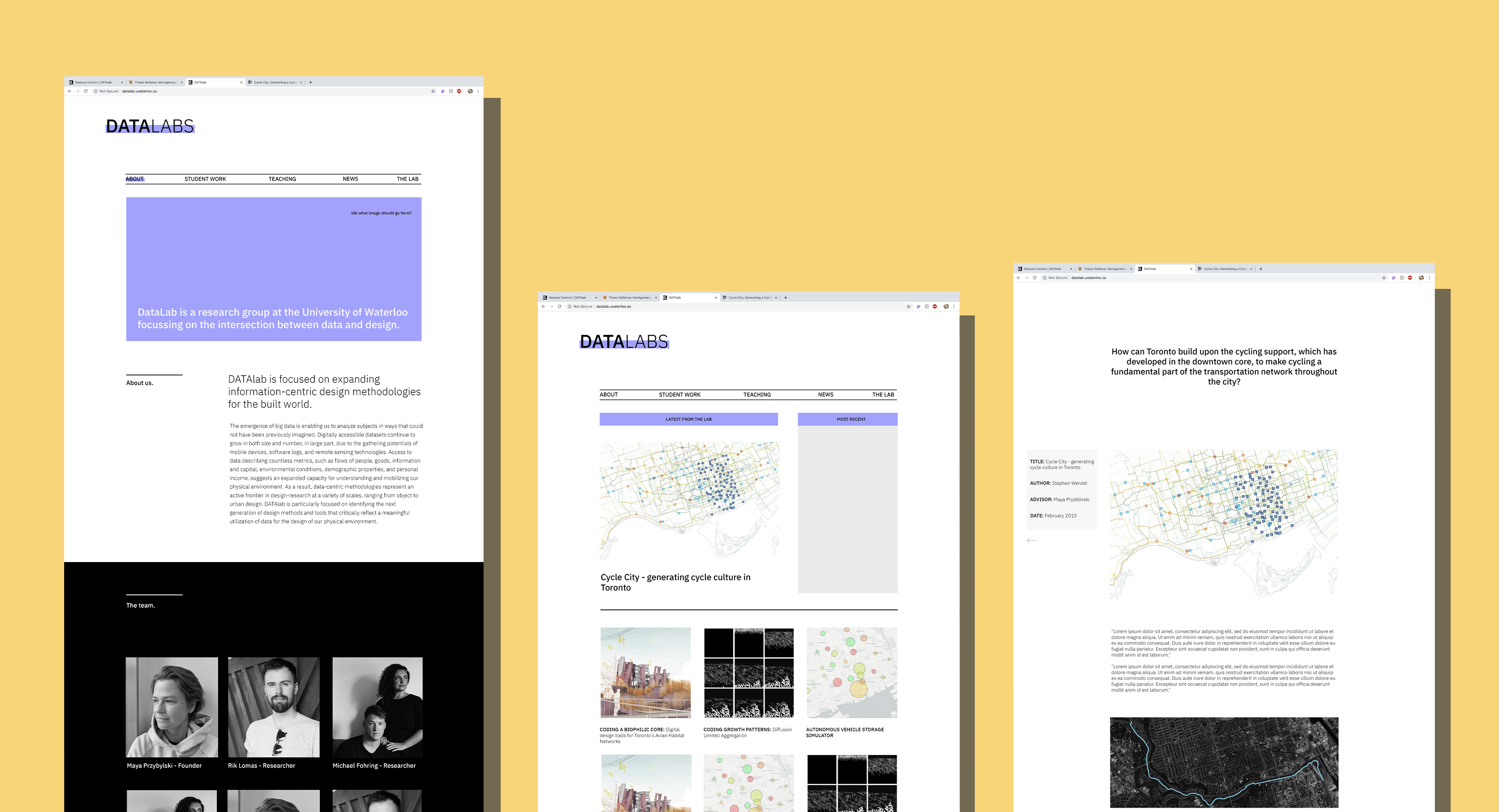

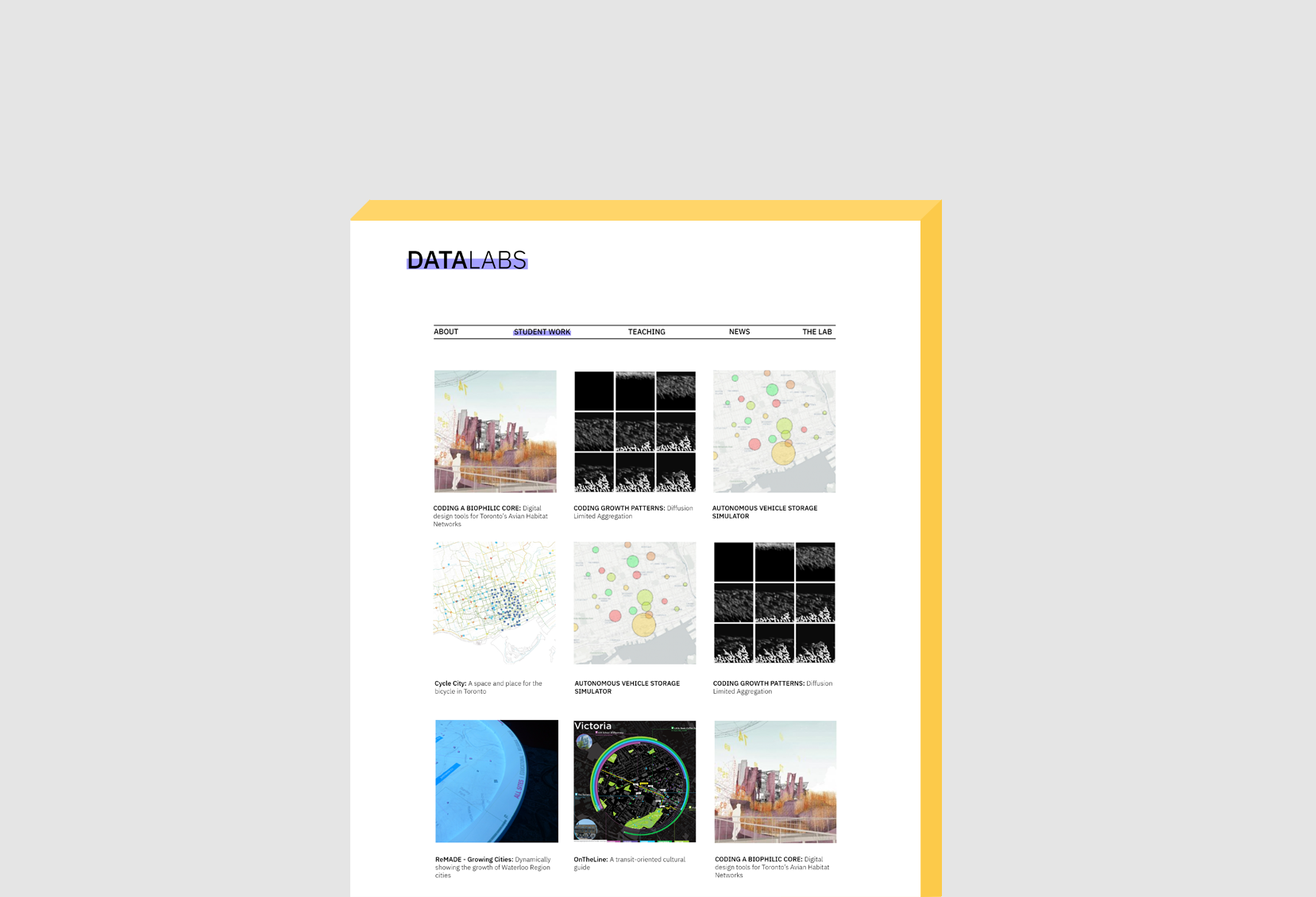
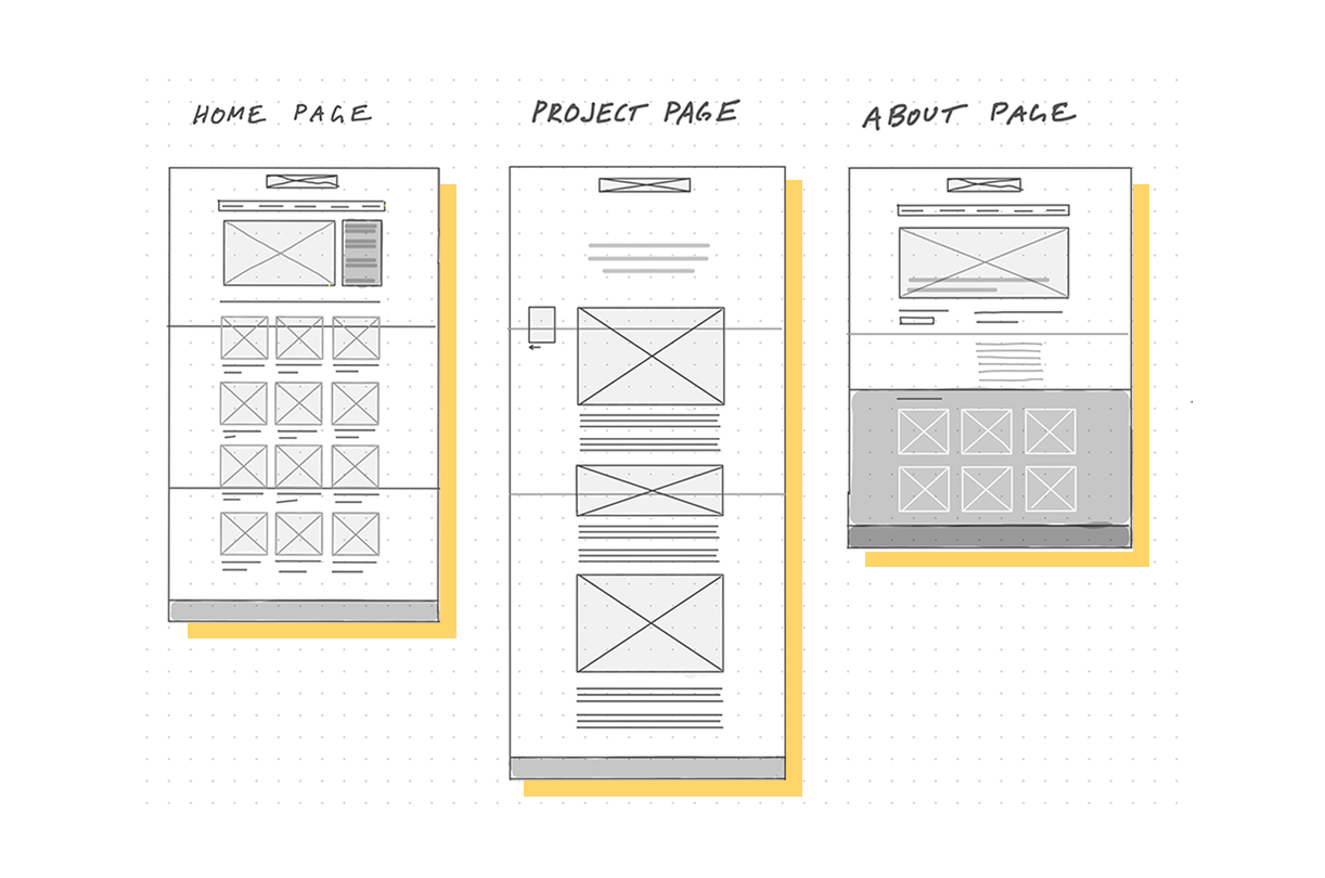
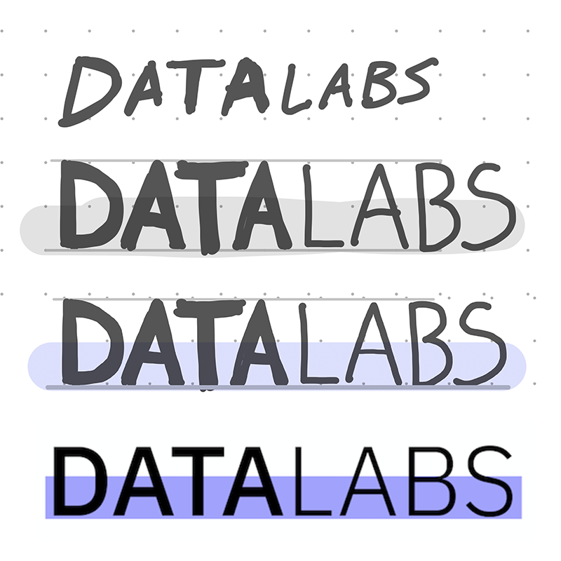
For the visual design and brand of DataLabs, I took inspiration from multiple architectural magazines and websites, to match the visual feel of the site content. I kept the logo minimal, to avoid distracting from the lab research and student projects, and chose to stick to a monochromatic theme, aside from a purple accent (in honour of the engineering and design research DataLabs does). This allowed the site to maintain a cohesive feel, despite the wide variety of project images and renders it hosted.